Top Tips on Visual Branding For your NFP
There are a number of considerations that need to be taken into account when deciding on your association or Not-For-Profit's visual branding message and some of these may include design, location and future growth.
This feature will be on Member Evolution's recent office move where our new location has based us in Brisbane's Technology Park in Eight Mile Plains. The strategic move has placed the team within the technology hub, with easy access to excellent facilities and conference areas.
The facilities and conference areas surrounding our new office space provide an opportunity for future growth and expansion within the marketing and software industry as well as the chance to utilise the space and enforce visual branding.
Visual Branding
Visual branding is important for all companies whether they be a Not-For-Profit organisation or association. Delivering a message while visually enforcing your brand to the consumers who pass by is important and getting the balance right is vital.
It is essential to get the design and message correct so consumers get the right idea about your company and the product you offer.
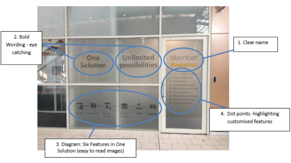
Member Evolution has combined the expertise of both the design and marketing team to deliver a simple but effective message. Our message consists of a clear, readable name - see image below - bold and brief, catchy wording at the top highlighting what we offer, a simple picture highlighting the six different features that we provide in an all in one solution targeted at associations and Not-For-Profit organisations. Underneath the name there are dot points explaining the customised solution and features the membership software provides. The design is simple and a true representation of the product including our competitive difference.
Location
The location of visual branding is crucial as you want maximum brand and product exposure. Your design should be unique and should show the strategic difference from your competitors.
The branding location for Member Evolution is on the side of our office which faces the conference foyer area within Technology Park. This way everyone attending corporate events including members, executives, managers and professionals will see the branding as they are walking through the entrance. Being on ground level also has its advantages as our branding is eye level with consumers.
Future Growth & Exposure
It is important to consider that over time your message may become irrelevant as your product or consumer focus may have changed to meet local or global demand and standards, an environmental focus may also be in the pipeline which is a great way to express competitive difference. These things change as businesses expand and grow and keeping your visual branding current shows a professional approach.
The Member Evolution visual branding is so far all internal, and within five months when renovations are complete, there will be external branding placed on the outside of the conference building. This will further improve exposure and brand awareness for the company.
When this transformation takes place the marketing and design team can then re-evaluate the key focus and message that they wish to portray and implement these changes.


