What Responsive Web Design Really Means for NFPs

Whether we are talking about apps that replace credit cards, curved glass, or wearable tech, smartphones are definitely a hot topic. These technology advancements excite consumers and responsive websites are becoming the norm. Users are adapting to new technologies at an exceptional rate, and responsive websites are becoming a priority as the majority of users will browse websites from their smartphones. The average user spends around 39% of their time online on a smartphone.
Understanding Responsive Websites
Before responsive we had mobile websites and before that there was one design for Blackberry another for iPhone, Kindle, tablets and any other type of device or screen resolution required. This has led to not being able to keep up with the endless new devices and screen resolutions on the market for web design and development. Creating a new website version for all devices is impossible and impractical. Developers would have had to look at the benefit of losing visitors from one device for the benefit of another, until responsive web design.
Why Responsive
 Responsive websites respond to the individual’s behaviour and environment depending on the screen size, platform and orientation in which it is being viewed on. The idea is to make all website pages look great on any size. It accommodates very large monitors right down to small smartphones creating a seamless user experience across all devices as well as being optimised for future devices.
A fundamental shift has begun in the way websites are crafted with the aim to provide optimal viewing and an interactive experience. A responsive website aids easy reading and navigation while minimising the need for resizing, scrolling and panning. Each day the number of devices, platforms and browsers that need to be able to work with your site grows, and you need to respond to this demand to ensure continuity in your marketplace.
An example where responsive designs make a lot of sense for associations and NFPs would be where you have a banner with text, it is easily read on a desk top and possibly even a tablet, but on mobile there will be no chance of a user being able to read the writing (as the image has been scaled down to a much smaller size), therefore the decision needs to be made -
- Remove the text on the desktop and just have images in the banner without a call to action
- Remove the text only on the mobile version and leave it for the desktop
- Use two rows of text, make one a heading and another line of text being more descriptive. Then you can show both the heading and descriptive text on a desk top and only show the title on a mobile.
In the past if you used a mobile website and a desktop website you would have had to edit and update both. With responsive, we can include it in the code.
User Problems with Unresponsive Websites
People are changing the way they use and interact with mobile technology and now 46% of people using mobile devices report having problems viewing a static site which is a traditional non-responsive website. 44% of people claimed navigation was also difficult on smaller devices. 40% will also choose another result if it is not mobile friendly.
These statistics indicate that consumers want to have optimal viewing of a website at all times and if they don’t they will abandoned that site and go to another which they can use and navigate effortlessly through. I’m sure you have experienced the same problem when you can’t view the entire news story or you can’t click on the link you wanted to. This frustrates the user and leaves them with a bad impression and experience of your brand or service.
User Benefits of Responsive Websites
The statistics from the use of mobile phones continues to rise with 4 out of 5 consumers shopping on their smartphones. 70% of mobile search leads to an action within an hour, this is a great conversion rate and you may be missing out on these conversions if you do not have a responsive website. The Facebook messaging app has over 1 billion users, this is nearly ⅙ of the world talking to each other via the mobile Facebook app. Gartner predicts by 2018 more than 50% of users will use a tablet or smartphone first for all online activities. These statistics indicate that there will be no slowing down. Consumers online expectations will also continue to develop.
Looking to the Future
Looking at the bigger picture can help your organisation decide whether responsive is the direction to take especially if you are looking to upgrade your membership management software solution. After all, your members are your future so it’s best to take their needs into consideration.
Statistics from:
http://johnpolacek.github.io/scrolldeck.js/decks/responsive/
http://www.smashingmagazine.com/2011/01/guidelines-for-responsive-web-design/
https://www.bopdesign.com/bop-blog/2015/02/responsive-web-design-statistics/
http://skillcrush.com/2014/11/11/9-mobile-statistics/
http://www.iacquire.com/blog/mobile-behavior-big-game-seating-a-study-with-surveymonkey
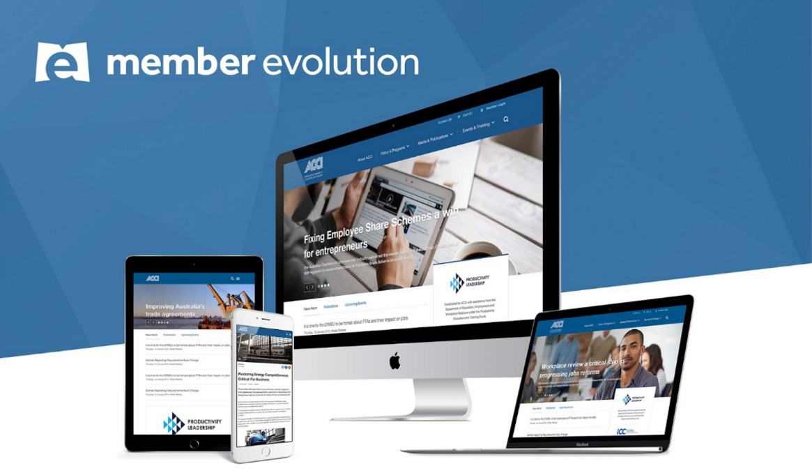
Member Evolution Association Member Management Solutions come with responsive websites included in our software packages. View our latest client ACCI’s responsive website here.